Senior Aid
Senior Aid
Senior Aid
UX Case Study by Smit Patil
UX Case Study by Smit Patil
UX Case Study by Smit Patil
TIMELINE
TIMELINE
TIMELINE
Jan - Feb 2025
Jan - Feb 2025
Jan - Feb 2025
PLATFORM
PLATFORM
Android, ios
Android, ios
PROJECT TYPE
PROJECT TYPE
TYPE
Passion
Passion
Passion
STATUS
STATUS
STATUS
Complete
Complete
Complete
Introduction
Introduction
Introduction
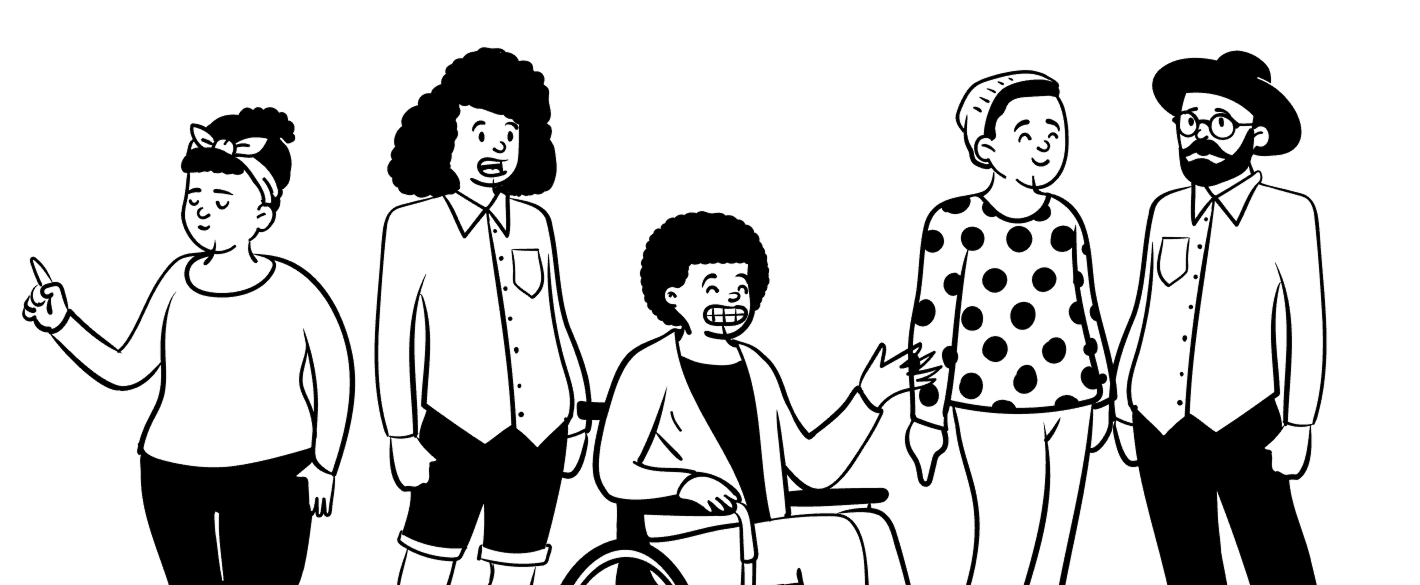
Senior Aid is a cutting-edge solution designed to assist elderly individuals with their daily health needs through a smart robot assistant, Sanjeevan Bot. This intuitive robot delivers medications on time, keeps track of vital health metrics like blood pressure and pulse rate, and even offers smoke detection analysis to ensure safety. A user-friendly mobile app interface allows family members to stay connected with the bot, ensuring elderly loved ones receive continuous care, even when family members are busy.
The Challenge
The Challenge
The Challenge
One of the key challenges was designing a page that felt mystical without being cliché. The client specifically requested that the visuals not lean too heavily into traditional astrological symbols or themes.
One of the key challenges was designing a page that felt mystical without being cliché. The client specifically requested that the visuals not lean too heavily into traditional astrological symbols or themes.
One of the key challenges was designing a page that felt mystical without being cliché. The client specifically requested that the visuals not lean too heavily into traditional astrological symbols or themes.
Another creative constraint was blending bright, nature-inspired colors with a sense of depth and spirituality. Balancing warmth with mystery — without compromising on readability or aesthetic consistency.
Another creative constraint was blending bright, nature-inspired colors with a sense of depth and spirituality. Balancing warmth with mystery — without compromising on readability or aesthetic consistency.
Another creative constraint was blending bright, nature-inspired colors with a sense of depth and spirituality. Balancing warmth with mystery — without compromising on readability or aesthetic consistency.

My Role
My Role
My Role

Defining the overall visual direction in line with the brand’s tone
Defining the overall visual direction in line with the brand’s tone
Defining the overall visual direction in line with the brand’s tone
Structuring the content for clarity, trust, and flow
Structuring the content for clarity, trust, and flow
Structuring the content for clarity, trust, and flow
Ensuring responsiveness and accessibility across screen sizes
Ensuring responsiveness and accessibility across screen sizes
Ensuring responsiveness and accessibility across screen sizes
Work closely with the client to translate abstract ideas into a clean, intuitive interface
Work closely with the client to translate abstract ideas into a clean, intuitive interface
Work closely with the client to translate abstract ideas into a clean, intuitive interface
What people seek from "Nodes and the Moon" ?
What people seek from "Nodes and the Moon" ?
What people seek from "Nodes and the Moon" ?
Clarity &
Grounding
Clarity &
Grounding
Clarity &
Grounding
Visitors often come during uncertain phases of life, seeking more than just predictions. They want clarity, emotional grounding, and a way to reconnect with themselves on a deeper level.
Visitors often come during uncertain phases of life, seeking more than just predictions. They want clarity, emotional grounding, and a way to reconnect with themselves on a deeper level.
Emotional
Resonance
Emotional
Resonance
Emotional
Resonance
Users are drawn to experiences that feel personal and reflective. They seek content that speaks directly to their emotions — something that affirms their inner journey and offers a fresh, comforting perspective.
Users are drawn to experiences that feel personal and reflective. They seek content that speaks directly to their emotions — something that affirms their inner journey and offers a fresh, comforting perspective.
Gentle
Guidance
Gentle
Guidance
Gentle
Guidance
Visitors often come during uncertain phases of life, seeking more than just predictions. They want clarity, emotional grounding, and a way to reconnect with themselves on a deeper level.
Visitors often come during uncertain phases of life, seeking more than just predictions. They want clarity, emotional grounding, and a way to reconnect with themselves on a deeper level.
Design Process
Design Process
Design Process
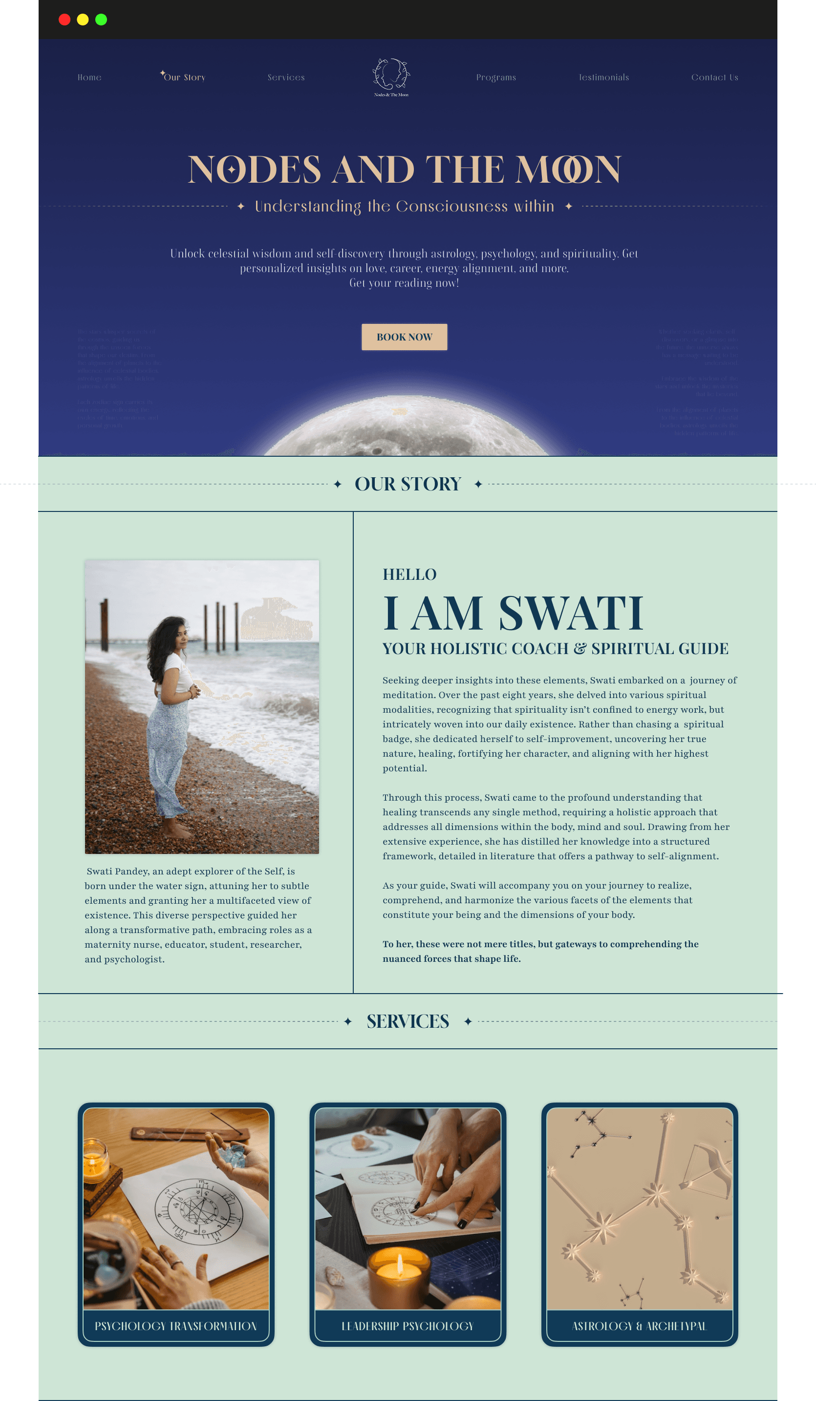
Page Structure
Page Structure
Page Structure
Hero Section
Hero Section
Hero Section
About Us
About Us
About Us
Services
Services
Services
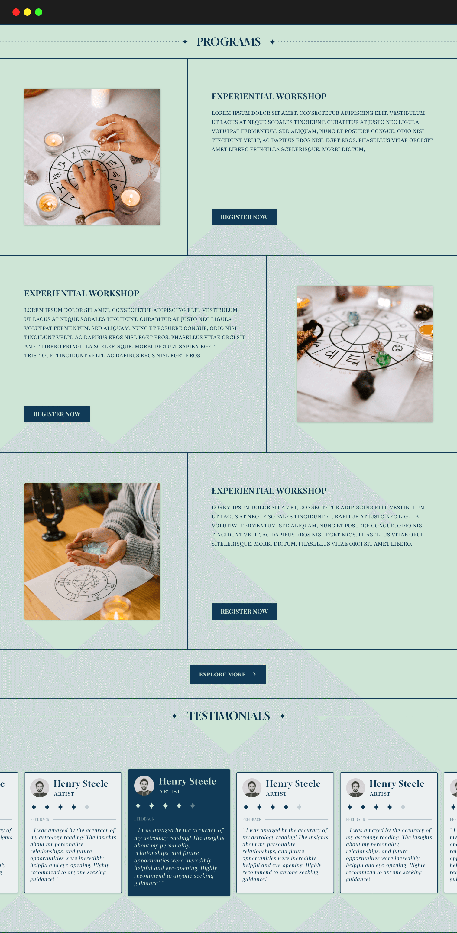
Programs
Programs
Programs
Testimonials
Testimonials
Testimonials
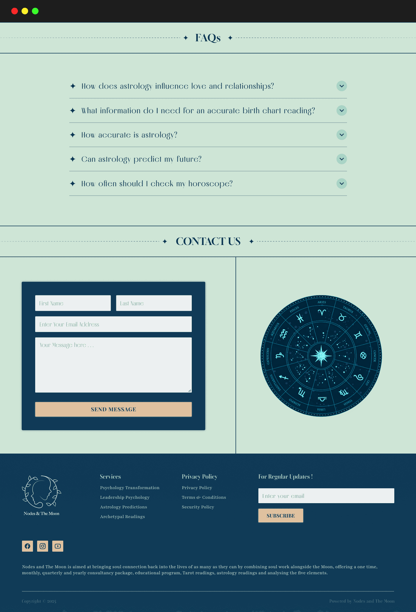
FAQs
FAQs
FAQs
Contact Us
Contact Us
Contact Us
Footer
Footer
Footer

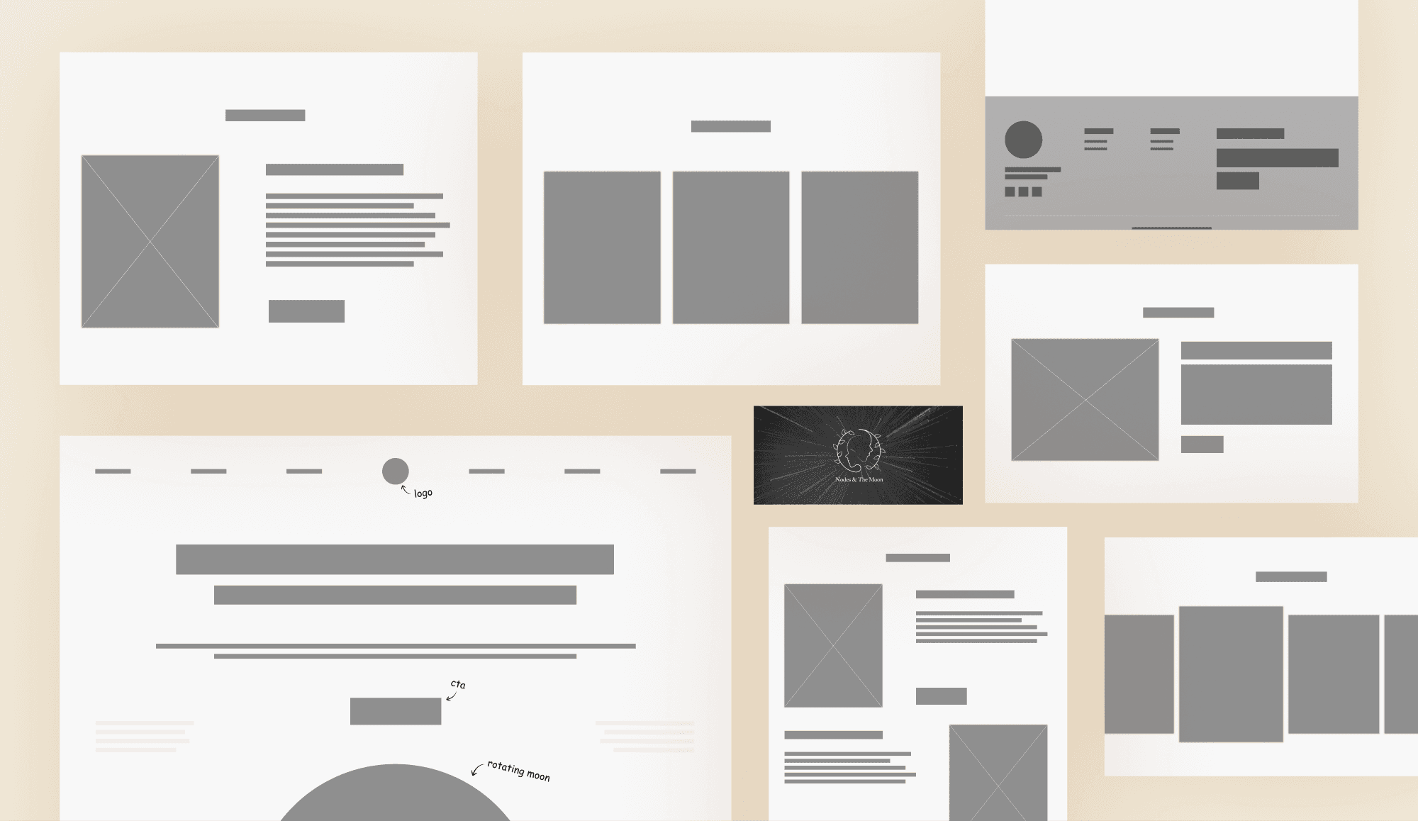
Wireframes
Wireframes
Wireframes
Color Palette
Color Palette
Color Palette
Primary Color
Primary Color
#0081FF
Azure Radiance
Azure Radiance
Sets a calm, soothing tone that reflects emotional clarity and ease.
Secondary Color
Secondary Color
#103A57
Prussian Blue
Prussian Blue
Adds depth and contrast while keeping the design grounded and serious.
Accent Color
Accent Color
#DFC19F
Warm Sand
Warm Sand
Brings warmth and subtly highlights key actions without overpowering.
Typography
Typography
Typography
Aa
Aa
Aa
Roboto Flex
Brings a refined, slightly vintage elegance. Its strong serifs give a sense of trust, tradition, and stability, resonating with the brand’s grounded, reflective tone.
Brings a refined, slightly vintage elegance. Its strong serifs give a sense of trust, tradition, and stability, resonating with the brand’s grounded, reflective tone.
Inter
Inter
Inter
Offers a graceful, literary charm. Its soft curves and classic style evoke intimacy, depth, and emotional warmth, perfect for creating a more personal connection with visitors.
Aa
Aa
Aa
Iterations
Final Designs
Final Designs
Final Designs
Take-aways
Take-aways
Take-aways
Scope of Improvements
Scope of Improvements
Scope of Improvements
Enhancing Health Tracking Capabilities
Enhancing Health Tracking Capabilities
Enhancing Health Tracking Capabilities
Expanding to more health-related metrics, such as sleep patterns or medication side effects, could provide a more comprehensive health tracking system.
Expanding to more health-related metrics, such as sleep patterns or medication side effects, could provide a more comprehensive health tracking system.
Expanding to more health-related metrics, such as sleep patterns or medication side effects, could provide a more comprehensive health tracking system.
Broader User Testing
Broader User Testing
Broader User Testing
Conducting user testing with a diverse group, especially elderly users, would provide deeper insights into usability and accessibility.
Conducting user testing with a diverse group, especially elderly users, would provide deeper insights into usability and accessibility.
Conducting user testing with a diverse group, especially elderly users, would provide deeper insights into usability and accessibility.
Integration with Wearable Technology
Integrating the app with wearables like smartwatches could allow real-time monitoring and provide users with more accurate data.
Integrating the app with wearables like smartwatches could allow real-time monitoring and provide users with more accurate data.
Integrating the app with wearables like smartwatches could allow real-time monitoring and provide users with more accurate data.
My Learnings
My Learnings
My Learnings
Designing with Empathy
Designing with Empathy
Designing with Empathy
Understanding the struggles of elderly users taught me that empathy should guide every design decision. Simplicity, readability, and emotional comfort matter as much as functionality.
Understanding the struggles of elderly users taught me that empathy should guide every design decision. Simplicity, readability, and emotional comfort matter as much as functionality.
Understanding the struggles of elderly users taught me that empathy should guide every design decision. Simplicity, readability, and emotional comfort matter as much as functionality.
Accessibility is the core, not feature
Accessibility is the core, not feature
Accessibility is the core, not feature
From color contrast to button size, I realized accessibility isn’t an optional layer — it’s the foundation of a truly inclusive experience.
From color contrast to button size, I realized accessibility isn’t an optional layer — it’s the foundation of a truly inclusive experience.
From color contrast to button size, I realized accessibility isn’t an optional layer — it’s the foundation of a truly inclusive experience.
Testing brings real insights
Testing brings real insights
Testing brings real insights
User testing with seniors revealed practical challenges I hadn’t anticipated. Small tweaks like confirmation sounds and voice prompts made the app far more intuitive.
User testing with seniors revealed practical challenges I hadn’t anticipated. Small tweaks like confirmation sounds and voice prompts made the app far more intuitive.
User testing with seniors revealed practical challenges I hadn’t anticipated. Small tweaks like confirmation sounds and voice prompts made the app far more intuitive.
THANK
YOU
THANK
YOU
THANK
YOU
R
R
R
R
DESIGNE
DESIGNE
DESIGNE
DESIGNE
© 2025 Smit Patil. All rights reserved
Designed with charm