Nodes and the Moon
Nodes and the Moon
Nodes and the Moon
UX Case Study by Smit Patil
UX Case Study by Smit Patil
UX Case Study by Smit Patil
TIMELINE
TIMELINE
TIMELINE
15 - 30 Mar 2025
Mar 2025
15 - 30 Mar 2025
PLATFORM
PLATFORM
Responsive Web
Responsive Web
PROJECT TYPE
TYPE
PROJECT TYPE
Freelance
Freelance
Freelance
STATUS
STATUS
STATUS
Production
Production
Production
Introduction
Introduction
Introduction
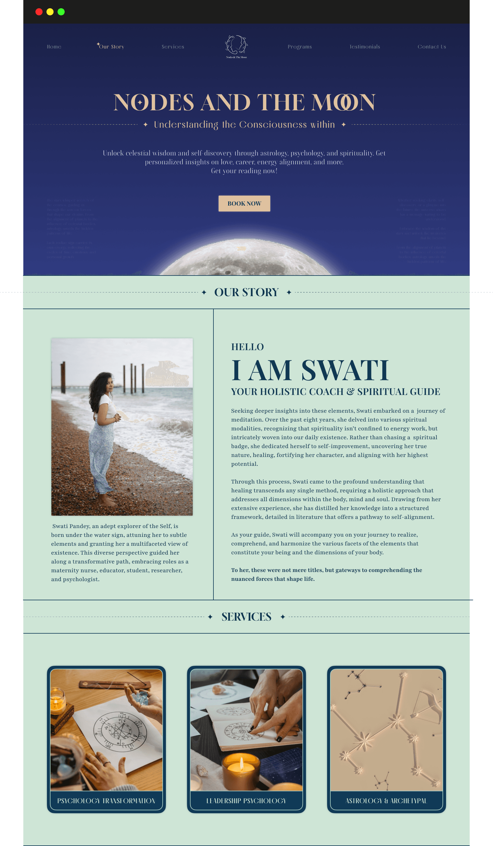
Nodes and the Moon is a wellness and spiritual guidance brand offering personalized sessions to help individuals find clarity, alignment, and purpose. The platform aims to create a space for reflection and self-discovery, guided by a modern approach to intuitive insights.
Nodes and the Moon is a wellness and spiritual guidance brand offering personalized sessions to help individuals find clarity, alignment, and purpose. The platform aims to create a space for reflection and self-discovery, guided by a modern approach to intuitive insights.
Nodes and the Moon is a wellness and spiritual guidance brand offering personalized sessions to help individuals find clarity, alignment, and purpose. The platform aims to create a space for reflection and self-discovery, guided by a modern approach to intuitive insights.
The Challenge
The Challenge
The Challenge
One of the key challenges was designing a page that felt mystical without being cliché. The client specifically requested that the visuals not lean too heavily into traditional astrological symbols or themes.
One of the key challenges was designing a page that felt mystical without being cliché. The client specifically requested that the visuals not lean too heavily into traditional astrological symbols or themes.
One of the key challenges was designing a page that felt mystical without being cliché. The client specifically requested that the visuals not lean too heavily into traditional astrological symbols or themes.
Another creative constraint was blending bright, nature-inspired colors with a sense of depth and spirituality. Balancing warmth with mystery — without compromising on readability or aesthetic consistency.
Another creative constraint was blending bright, nature-inspired colors with a sense of depth and spirituality. Balancing warmth with mystery — without compromising on readability or aesthetic consistency.
Another creative constraint was blending bright, nature-inspired colors with a sense of depth and spirituality. Balancing warmth with mystery — without compromising on readability or aesthetic consistency.

My Role
My Role
My Role

Defining the overall visual direction in line with the brand’s tone
Defining the overall visual direction in line with the brand’s tone
Defining the overall visual direction in line with the brand’s tone
Structuring the content for clarity, trust, and flow
Structuring the content for clarity, trust, and flow
Structuring the content for clarity, trust, and flow
Ensuring responsiveness and accessibility across screen sizes
Ensuring responsiveness and accessibility across screen sizes
Ensuring responsiveness and accessibility across screen sizes
Work closely with the client to translate abstract ideas into a clean, intuitive interface
Work closely with the client to translate abstract ideas into a clean, intuitive interface
Work closely with the client to translate abstract ideas into a clean, intuitive interface
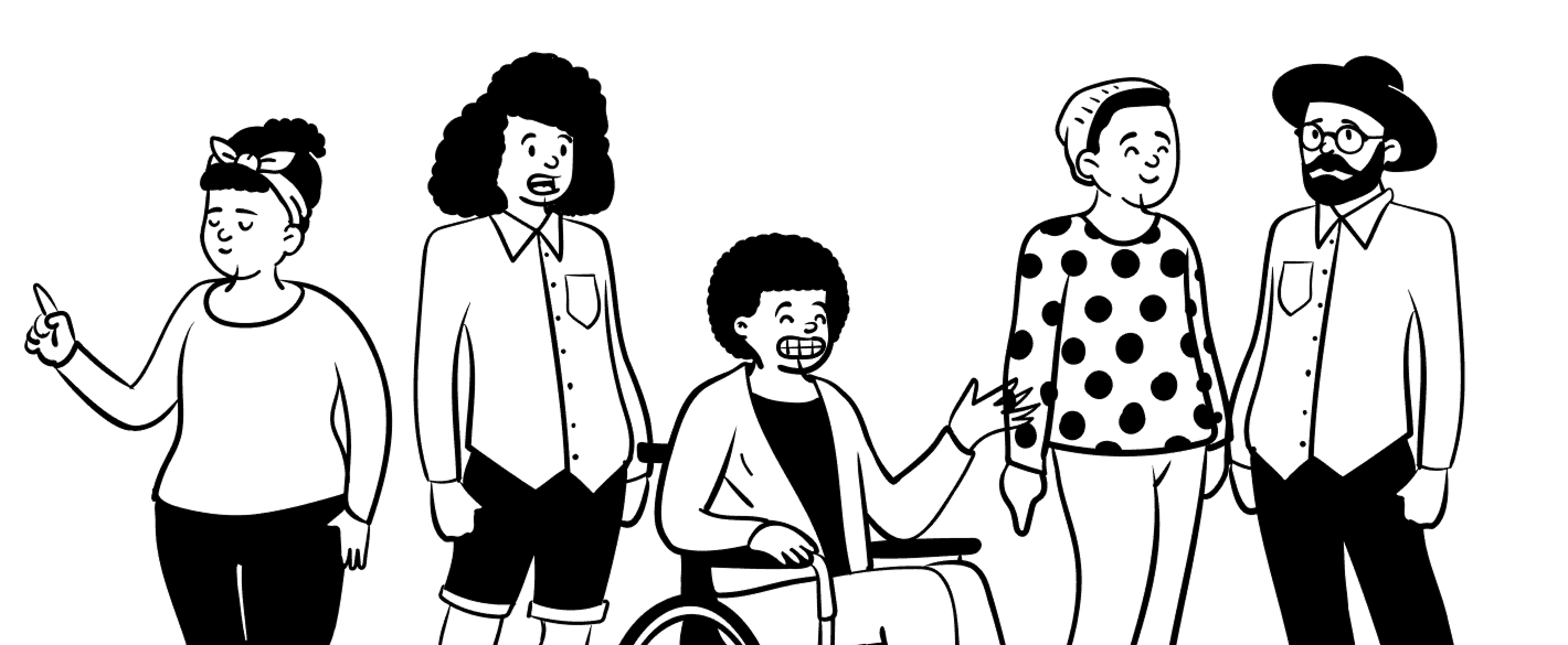
What people seek from "Nodes and the Moon" ?
What people seek from "Nodes and the Moon" ?
What people seek from "Nodes and the Moon" ?
Clarity &
Grounding
Clarity &
Grounding
Clarity &
Grounding
Visitors often come during uncertain phases of life, seeking more than just predictions. They want clarity, emotional grounding, and a way to reconnect with themselves on a deeper level.
Visitors often come during uncertain phases of life, seeking more than just predictions. They want clarity, emotional grounding, and a way to reconnect with themselves on a deeper level.
Emotional
Resonance
Emotional
Resonance
Emotional
Resonance
Users are drawn to experiences that feel personal and reflective. They seek content that speaks directly to their emotions — something that affirms their inner journey and offers a fresh, comforting perspective.
Users are drawn to experiences that feel personal and reflective. They seek content that speaks directly to their emotions — something that affirms their inner journey and offers a fresh, comforting perspective.
Gentle
Guidance
Gentle
Guidance
Gentle
Guidance
Visitors often come during uncertain phases of life, seeking more than just predictions. They want clarity, emotional grounding, and a way to reconnect with themselves on a deeper level.
Visitors often come during uncertain phases of life, seeking more than just predictions. They want clarity, emotional grounding, and a way to reconnect with themselves on a deeper level.
Design Process
Design Process
Design Process
Page Structure
Page Structure
Page Structure
Hero Section
Hero Section
Hero Section
About Us
About Us
About Us
Services
Services
Services
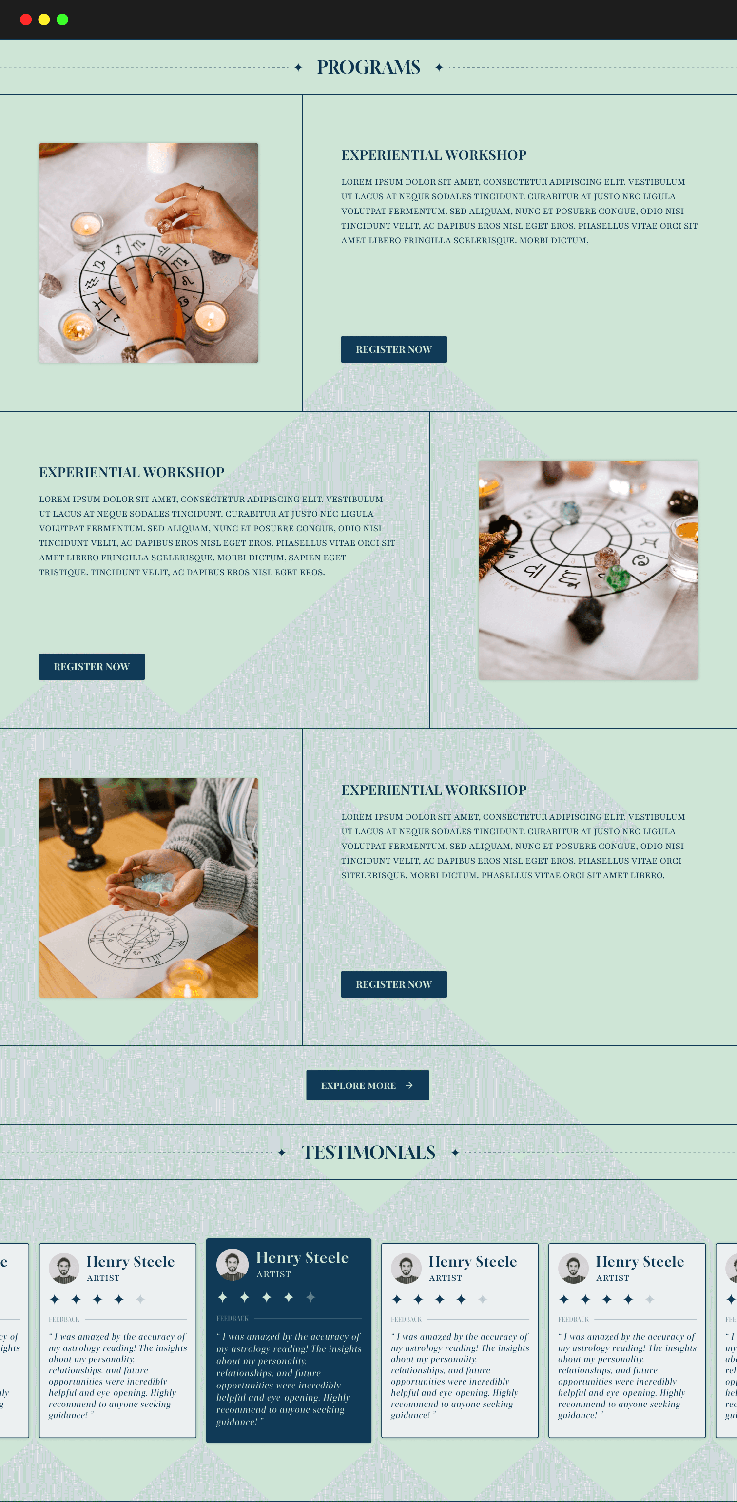
Programs
Programs
Programs
Testimonials
Testimonials
Testimonials
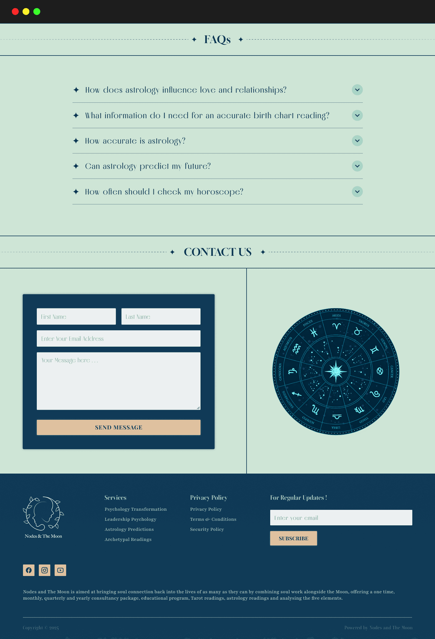
FAQs
FAQs
FAQs
Contact Us
Contact Us
Contact Us
Footer
Footer
Footer

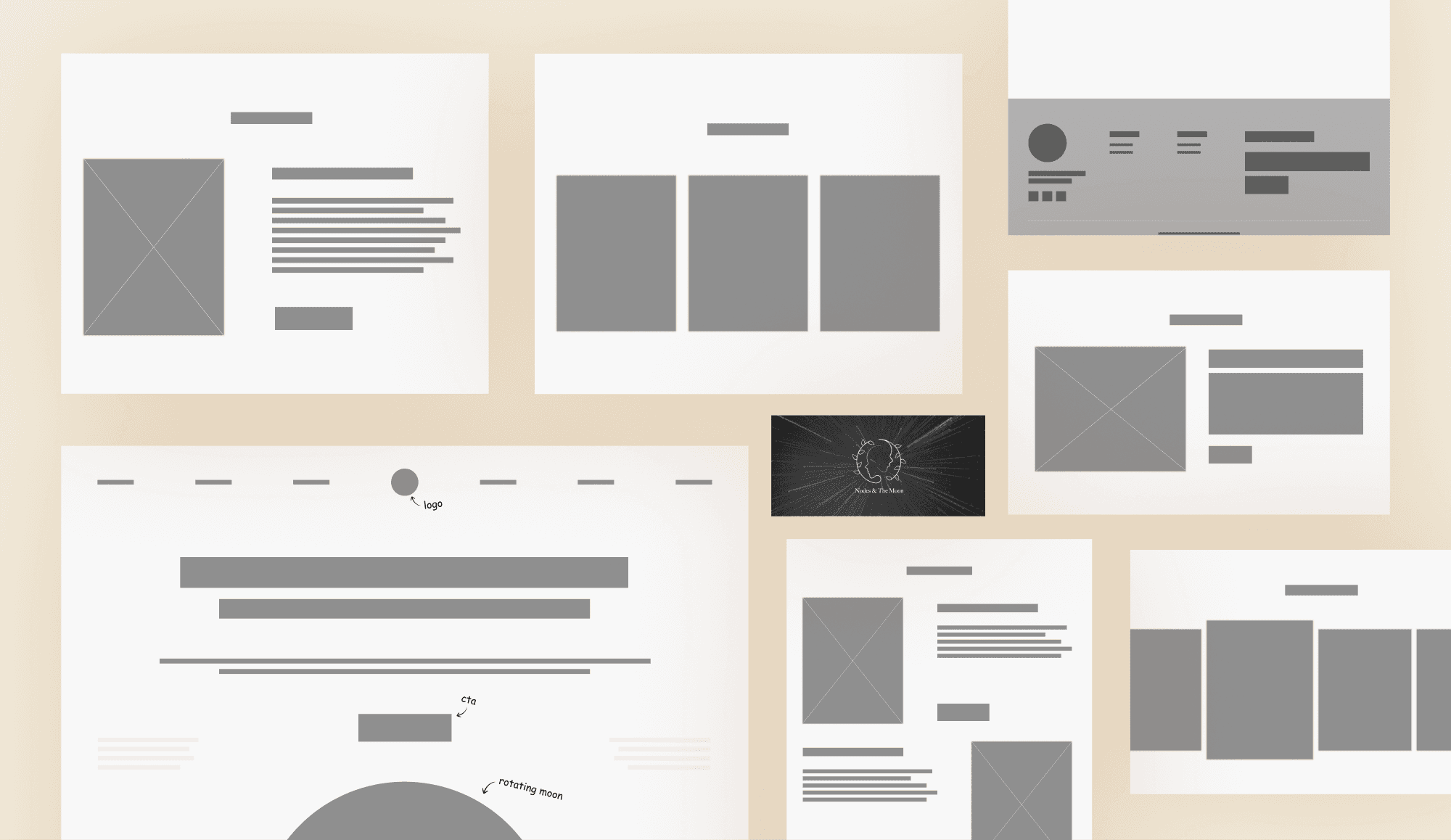
Wireframes
Wireframes
Wireframes
Color Palette
Color Palette
Color Palette
Primary Color
Primary Color
#A9D3C5
Pastel Green
Pastel Green
Sets a calm, soothing tone that reflects emotional clarity and ease.
Secondary Color
Secondary Color
#103A57
Prussian Blue
Prussian Blue
Adds depth and contrast while keeping the design grounded and serious.
Accent Color
Accent Color
#DFC19F
Warm Sand
Warm Sand
Brings warmth and subtly highlights key actions without overpowering.
Typography
Typography
Typography
Aa
Aa
Aa
Gloock
Gloock
Gloock
Brings a refined, slightly vintage elegance. Its strong serifs give a sense of trust, tradition, and stability, resonating with the brand’s grounded, reflective tone.
Brings a refined, slightly vintage elegance. Its strong serifs give a sense of trust, tradition, and stability, resonating with the brand’s grounded, reflective tone.
Playfair Display
Playfair Display
Playfair Display
Offers a graceful, literary charm. Its soft curves and classic style evoke intimacy, depth, and emotional warmth, perfect for creating a more personal connection with visitors.
Aa
Aa
Aa
Final Designs
Final Designs
Final Designs
User Feedback
User Feedback
User Feedback
"The color palette and typography choices feel balanced and align well with the brand’s tone."
"The color palette and typography choices feel balanced and align well with the brand’s tone."
"The color palette and typography choices feel balanced and align well with the brand’s tone."
DESIGNER
DESIGNER
DESIGNER
"I like how everything is easy to find without feeling cluttered."
"I like how everything is easy to find without feeling cluttered."
WEB USER
WEB USER
WEB USER
"I felt the design reflected the brand’s calming and introspective vibe."
"I felt the design reflected the brand’s calming and introspective vibe."
WEB USER
WEB USER
WEB USER
Take-aways
Take-aways
Take-aways
Balance of Aesthetics & Usability
Balance of Aesthetics & Usability
Balance of Aesthetics & Usability
Learned how to merge a mystical, nature-inspired aesthetic with clear, intuitive navigation. This ensured the design felt immersive without overwhelming the visitor, creating a seamless journey from curiosity to engagement.
Learned how to merge a mystical, nature-inspired aesthetic with clear, intuitive navigation. This ensured the design felt immersive without overwhelming the visitor, creating a seamless journey from curiosity to engagement.
Learned how to merge a mystical, nature-inspired aesthetic with clear, intuitive navigation. This ensured the design felt immersive without overwhelming the visitor, creating a seamless journey from curiosity to engagement.
Value of Iterative Testing
Value of Iterative Testing
Value of Iterative Testing
Even small, informal rounds of feedback uncovered subtle opportunities for improvement. These adjustments, though minor, collectively elevated the overall polish and effectiveness of the design.
Even small, informal rounds of feedback uncovered subtle opportunities for improvement. These adjustments, though minor, collectively elevated the overall polish and effectiveness of the design.
Even small, informal rounds of feedback uncovered subtle opportunities for improvement. These adjustments, though minor, collectively elevated the overall polish and effectiveness of the design.
Storytelling through Design
Storytelling through Design
Storytelling through Design
Understood that colors, typography, and layout choices can embody the brand’s story just as powerfully as written content. The design became a visual narrative that invited users to connect on both emotional and aesthetic levels.
Understood that colors, typography, and layout choices can embody the brand’s story just as powerfully as written content. The design became a visual narrative that invited users to connect on both emotional and aesthetic levels.
Understood that colors, typography, and layout choices can embody the brand’s story just as powerfully as written content. The design became a visual narrative that invited users to connect on both emotional and aesthetic levels.
THANK
YOU
THANK
YOU
THANK
YOU
R
R
R
R
DESIGNE
DESIGNE
DESIGNE
DESIGNE
© 2025 Smit Patil. All rights reserved
Designed with charm